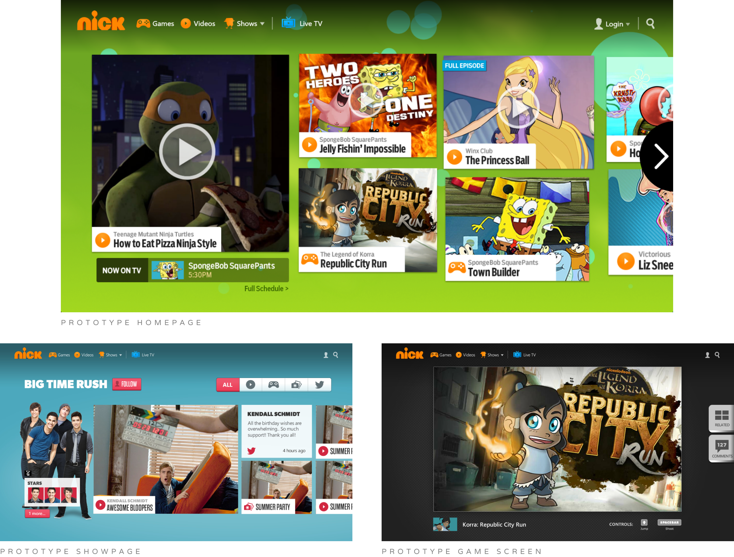
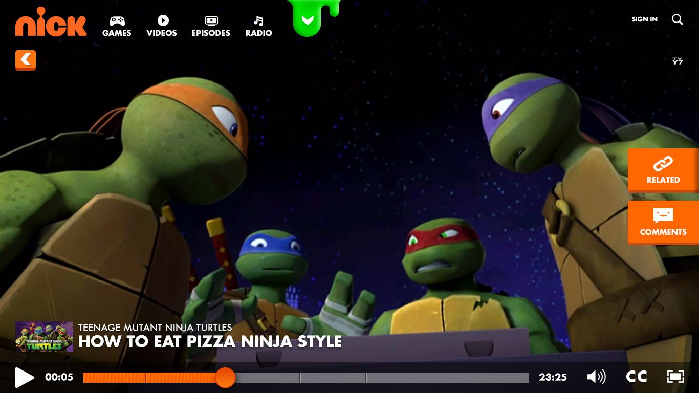
banners-nick-redesign.jpg

Nick.com Redesign

Nick.com Redesign

View Case Study

Nickelodeon had launched the iOS Nick App in 2012 (which won a Daytime Emmy for Outstanding Creative Achievement In Interactive Media – User Experience and Visual Design).

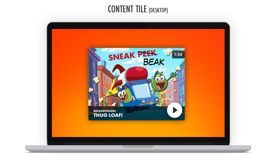
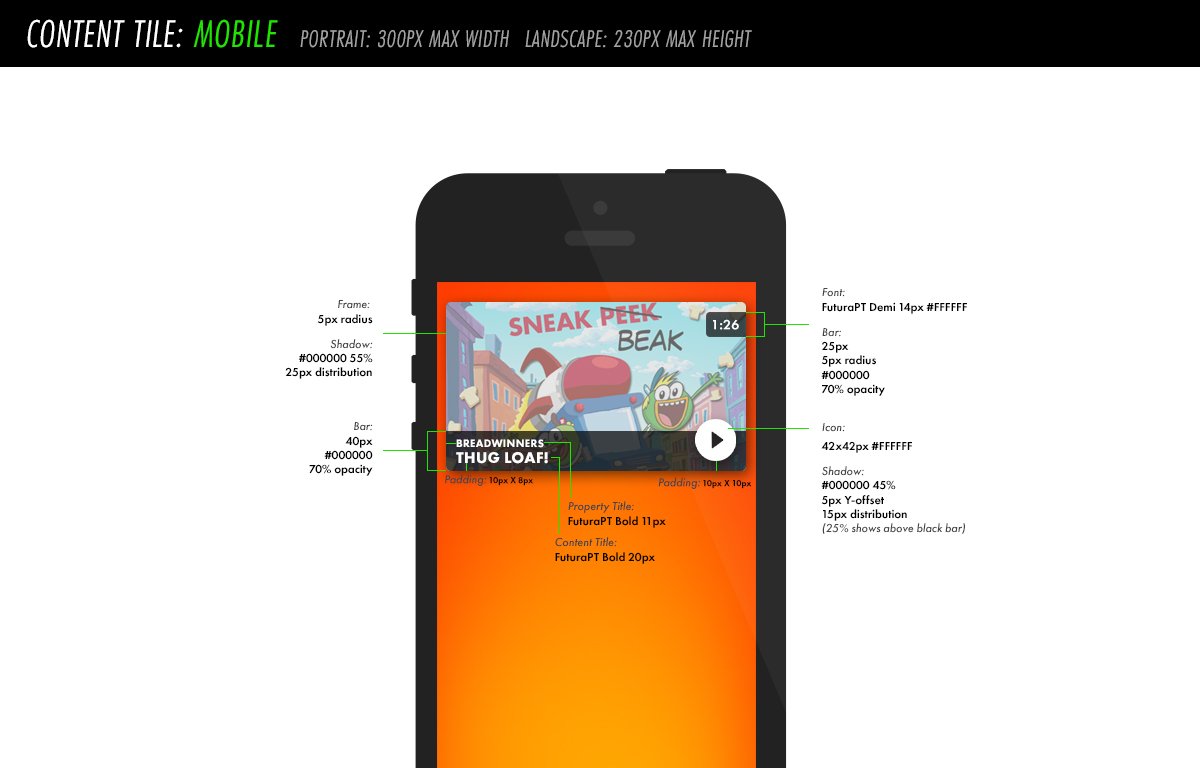
There was an initiative from Product to revamp the Nick.com website to mimic the app success & experience. Over the course of many months, the team created the custom site from the bottom up. I led the visual designs, working alongside developers and UX designers,
we solved issues, iterated designs, & shaped a responsive website with a simple experience for our users.


Product had created a prototype idea, built in Windows8, that was presented & sold to Nickelodeon’s president.

These are the initial first looks of what the new site could look like within a horizontal layout.
*Excluded from this prototype were Ads, break points, proper font sizes, legal/footer information, show character pages.


Once the new initiative to revamp the website and the prototype was green-lit, the project then landed in Design’s realm, where we first did a lot of research in grid layouts. At the time, the team was transitioning into an Agile workflow and dividing into Product Design and Brand Design pods.


This was a completely new territory for the team so we had to really explore grid layouts and see how our content could potentially work within a horizontal layout.


We explored how the grid would translate among other pages. We landed on the grid being mostly consistent across all pages, with the exception of a “Featured” tile on the homepage.

Working with Legal & Standards, we had a requirement that an Ad must be always visible, prior to any scrolling.

Our space for showart was drastically decreased from the original site. The narrow vertical space for showart created quite a struggle for most shows, as they have multiple characters that must be featured.


Character limits and minimum sizes for desktop & mobile were established while developing the overall UI of the tiles.


Content tiles came in 3 sizes: 1:1, 4:3, 16:9


The video player was the first to be worked on, as it’d be the most complex from an engineering standpoint.


A style guide was slowly coming together, which will help the rest of the team when it comes to create new showpages.

The team was able to have some creative freedom when it came to compositing the showart & background graphics, but still had to follow brand guidelines; for both Nickelodeon & the individual show properties.


The final look of the site was a long process. We had 26 shows to feature on the website. Each required roughly 34 assets for production (if the show featured at least 2 characters) across all breakpoints.